
The European Central Bank has unveiled 10 proposals for a full redesign of euro banknotes, the first since the single currency’s paper money entered circulation in 2002. The public gets to click through a survey on the ECB’s website until 21 September, but the central bank won’t let that decide anything on its own. A second, quantitative survey and the verdict of a jury of designers will also shape the choice, with the winner due at the end of 2026.
Brussels Designs the Money, Everyone Else Reacts
This is how the euro’s paper face gets remade: from the top, by the ECB, with a public survey as garnish. The bank says the feedback will feed into the decision, but not solely determine it. The people who use the notes don’t get control over the process. They get a questionnaire.
The 10 proposals split into two themes, culture and wildlife. Five designs feature Maria Callas, the American-Greek soprano; Beethoven, the German composer; Curie, the Polish-French scientist; Cervantes, the author of Don Quixote; Leonardo da Vinci, the Renaissance polymath; and Bertha von Suttner, the Austrian pacifist and women’s liberation leader. The other five go with the wallcreeper, the kingfisher, the bee-eater, the white stork, the avocet and the northern gannet, set against different landscapes typical of the continent.
Each proposal offers a different graphic treatment of the €5, €10, €20, €50, €100 and €200 notes, all of which were determined by the ECB in advance. The new notes will stay on paper rather than switch to polymer, unlike in some countries such as the UK. They won’t enter circulation until 2030 or 2031. So the institution that already controls the currency gets years to polish its image while the notes themselves remain a future product, not a present reality.
The Single Currency Wants a Better Face
Philippe Geoffroy, the head of section for new banknotes at the ECB, said: “The feedback from the public has been very clear. They want money that feels European.” He also said: “The main reason behind the re-design is to stay well ahead of counterfeiting. But along the way we want to increase identification with the single currency and make it more graphically meaningful. We want to move away from neutrality.”
That last line matters. The ECB is not just talking about anti-counterfeiting measures. It wants identification. It wants the currency to feel European. It wants to move away from neutrality, which in practice means replacing the old blank architecture with a more deliberate political image of the eurozone. The bank is choosing symbols for a currency that already binds together the political, legal and financial institutions in Brussels, Strasbourg, Luxembourg and Frankfurt.
The shortlist came from 1,241 applications to an open call in 2025. A Dutch book designer, Joost Grootens, cropped the cultural figures tightly around their eyes, accentuating their vision rather than their iconic status. Jan Robert Dünnwelle, a German illustrator, drew the same personalities in a free-flowing, sketchy style of a graphic novel. In the French artist Isabelle Daëron’s proposals, the birds fly across a vertical layout rather than the more conventional horizontal one. Ville Tietäväinen, a Finnish graphic designer, showed the birds’ journeys in sequence, moving from the mountains to the sea.
The process has the familiar democratic sheen of an institution that likes participation when it can manage the terms. Open call. Survey. Jury. Final decision elsewhere.
Institutions on the Notes, Institutions in Control
The wildlife-themed notes would be paired on their flipside with pictures of buildings that house the EU’s political, legal and financial institutions in Brussels, Strasbourg, Luxembourg and Frankfurt. The birds are not exclusively European. Neither are the cultural figures neatly contained by borders. That doesn’t stop the ECB from using them to stage a visual story about the single currency and the institutions that govern it.
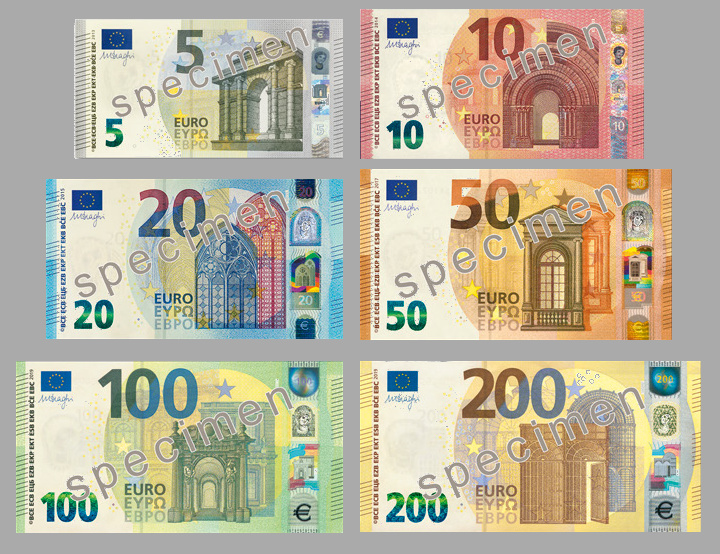
The current euro banknotes deliberately use neutral motifs to avoid offending individual member nations: imaginary bridges, doorways and windows that represent historic architectural styles without showing specific real-life European buildings or places. New notes including the face of the mythological princess Europa in the watermark and the hologram stripe were introduced in 2013 without changing the overall design.
Britain’s Bank of England drew some ire earlier this year when it announced redesigned notes would depict wildlife instead of historical figures such as Winston Churchill or William Shakespeare. The ECB’s version of the same exercise is more bureaucratic, more continental, and no less controlled. It is a competition over symbols, but the real power stays where it always was: in the central bank, in the institutions printed on the back, and in the hands that decide what money should feel like.
The euro’s paper money entered circulation in 2002. Twenty-four years later, the ECB is still deciding how the currency should look, who it should honour, and how much Europe should be visible on the notes that pass through ordinary hands every day.